
Envisioning the success of your business involves ensuring that you have a strong online presence, and a responsive website design is crucial in achieving that goal. In today’s digital age, the majority of consumers rely on their mobile devices to access websites. If your website is not responsive and mobile-friendly, you are potentially missing out on a significant amount of traffic and revenue. Not only does a responsive design improve user experience and increase the likelihood of conversions, but it also boosts your search engine rankings, as search engines prioritize mobile-friendly websites in their results. Additionally, a responsive website design enhances your brand’s credibility and professionalism, ultimately contributing to long-term success and growth for your business. It’s time to invest in a responsive design and ensure that your business is equipped to thrive in today’s online marketplace.
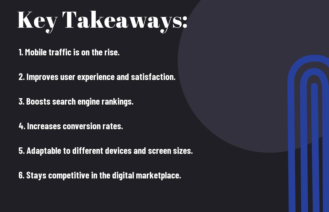
Key Takeaways:
- Increased Mobile Traffic: A responsive website design ensures that your business can reach and engage with the growing number of mobile users.
- Improved User Experience: With a responsive design, your website will adapt to different devices, providing a seamless and user-friendly experience for visitors.
- Boosted SEO Performance: Having a responsive website design can positively impact your search engine rankings, as Google favors mobile-friendly sites.
- Higher Conversion Rates: Responsive websites are more likely to lead to conversions and sales, as they provide a consistent and accessible experience across all devices.
- Future-Proofing Your Business: As the use of mobile devices continues to rise, investing in a responsive website design ensures that your business remains relevant and competitive in the digital landscape.
The Essentials of Responsive Website Design
Obviously, having a responsive website design is essential for your business success in today’s digital world. So, what exactly does responsive website design entail, and why is it so important for your business?
Defining Responsive Website Design
Responsive website design refers to a design approach that ensures your website looks and functions seamlessly on any device, whether it’s a desktop, laptop, tablet, or smartphone. This means that no matter how visitors access your site, they will have an optimal viewing and interactive experience. With a responsive design, your website adapts to the screen size and device capabilities, providing a user-friendly experience no matter the platform.
Key Features of a Responsive Website
Key features of a responsive website include fluid grids and layouts, flexible images and media, and a smart use of CSS media queries. This means that your website will automatically adjust to the screen size and orientation of the device being used, ensuring that the content is displayed in an easily readable and navigable manner. Fluid grids and layouts allow for content to dynamically resize and reorient itself to best fit the screen, while flexible images and media ensure that visual elements are displayed appropriately. CSS media queries enable different styles to be applied based on the device’s specific characteristics, creating a seamless user experience regardless of platform. After all, a responsive website should prioritize user experience above all else.
- Fluid grids and layouts
- Flexible images and media
- CSS media queries for device-specific styling
Benefits of Having a Responsive Website
Now that you understand the importance of having a responsive website design, let’s dive into the various benefits it offers for your business.
Improved User Experience
Having a responsive website is crucial for providing an optimal user experience. When your website is responsive, it automatically adjusts to different screen sizes and devices, ensuring that your visitors have a seamless and consistent experience no matter how they access your site. This means that whether someone is visiting your website on a desktop, smartphone, or tablet, they will enjoy easy navigation, fast load times, and engaging content.
Advantage in SEO Rankings
Responsive websites are favored by search engines like Google. In fact, having a mobile-friendly website is now a key ranking factor for search engine results. By having a responsive website design, you are signaling to search engines that your website is user-friendly and provides a positive experience for visitors. This can lead to improved visibility in search results, ultimately driving more organic traffic to your site.
Implementing Responsive Design
For your business to successfully implement a responsive design, you need to take into consideration various aspects. It’s essential to ensure that your website is not only visually appealing but also user-friendly across different devices, including smartphones, tablets, and desktops. This means that your website’s layout, images, and content should adjust seamlessly to fit the screen size of the device being used. Implementing responsive design requires a strategic approach and a clear understanding of common pitfalls to avoid.
How to Approach a Responsive Design Strategy
When approaching a responsive design strategy for your business, start by analyzing your current website’s performance across different devices. Identify any areas of weakness or inconsistency and prioritize which elements need to be optimized for better user experience. Utilize design principles such as fluid grids, flexible images, and media queries to create a seamless and efficient responsive website. Collaborate with experienced web designers and developers to ensure that the implementation process is smooth and effective.
Common Pitfalls to Avoid
One of the common pitfalls to avoid when implementing responsive design is failing to prioritize content and functionality. It’s crucial to prioritize the most important elements of your website and ensure they are prominently displayed, regardless of the device being used. Additionally, ignoring mobile load times can negatively impact user experience and lead to high bounce rates. Another pitfall to avoid is overloading your website with unnecessary features or large images, which can slow down the loading time and frustrate users. By addressing these common pitfalls, you can ensure that your responsive design is both efficient and user-friendly.
Case Studies
Keep in mind the powerful impact a responsive website design can have on your business. Here are some case studies to give you a better understanding of the benefits:
- Company A saw a 30% increase in mobile traffic and a 15% increase in overall revenue after implementing a responsive design. 8 Reasons to Have a Responsive Web Design (Infographic)
- Company B experienced a 50% reduction in bounce rate and a 20% increase in conversions after revamping their website with a responsive design.
- Company C reported an 80% boost in mobile sales and a 40% increase in search engine rankings after adopting a responsive website.
Success Stories of Responsive Redesigns
Many businesses have experienced remarkable success after implementing a responsive website design. By optimizing their websites for mobile devices, they have seen a dramatic increase in traffic and conversion rates. This has allowed them to reach a broader audience and improve overall user experience.
Analyzing the ROI of Responsive Design Adaptations
When it comes to analyzing the return on investment (ROI) of responsive design adaptations, the numbers speak for themselves. With the significant increase in mobile usage over the years, failing to have a responsive website can lead to a loss of potential customers and a negative impact on your bottom line. Furthermore, responsive design can lead to higher search engine rankings and improved overall user satisfaction.
Why Your Business Needs a Responsive Website Design
Considering all points, it is clear that a responsive website design is crucial for the success of your business. With the increasing use of mobile devices, an optimized website that provides a seamless user experience across all platforms is essential. Not only does it improve user satisfaction, but it also positively impacts your search engine rankings and overall online presence. By investing in a responsive website design, you demonstrate your commitment to meeting the needs of your audience and staying ahead of your competition. It is a wise business decision that will ultimately lead to increased traffic, conversions, and ultimately, business growth. Don’t overlook the importance of a responsive website design in today’s digital landscape – it is a vital tool for your success.
FAQ
Q: What is responsive website design and why does my business need it?
A: Responsive website design is a design approach that ensures a website looks great and functions well on any device, including smartphones, tablets, and desktop computers. Your business needs a responsive website design to provide a seamless and user-friendly experience for all potential customers, regardless of the devices they use to access your site.
Q: How does responsive website design benefit my business?
A: Responsive website design benefits your business in several ways. It improves user experience, leading to increased customer satisfaction and higher conversion rates. It also boosts your website’s search engine rankings, as search engines like Google prioritize mobile-friendly websites. Additionally, a responsive design saves you time and money by eliminating the need for separate mobile and desktop versions of your site.
Q: Will a responsive website design help my business reach a larger audience?
A: Yes, a responsive website design can help your business reach a larger audience. With the increasing use of smartphones and tablets, having a website that adapts to different screen sizes and devices ensures that your content is easily accessible to all users. This accessibility can lead to increased traffic and engagement with your brand.
Q: How can I make my website design responsive?
A: To make your website design responsive, you can utilize a responsive design framework, such as Bootstrap or Foundation. These frameworks provide pre-built components and grid systems that make it easier to create a responsive layout. You can also work with a web designer or developer who is experienced in responsive design to ensure that your website functions perfectly across all devices.
Q: Is responsive website design a worthwhile investment for my business?
A: Yes, responsive website design is a worthwhile investment for your business. With the majority of internet users accessing websites on mobile devices, having a responsive design is essential for staying competitive in today’s digital landscape. It not only enhances user experience and engagement but also helps in improving your brand’s credibility and trustworthiness. Ultimately, the benefits of a responsive website design far outweigh the initial investment.